Case study
Benchmarking the user experience
Comparing two Learn Path concepts at Fretello using SUM, the single usability metric.

Owned: Test plan, prototypes (ProtoPie), task scripts, data analysis, the call on the combined design
Why use this method
Two designs, both look great, neither one obviously wins. That's the moment to stop arguing about screenshots and start measuring.
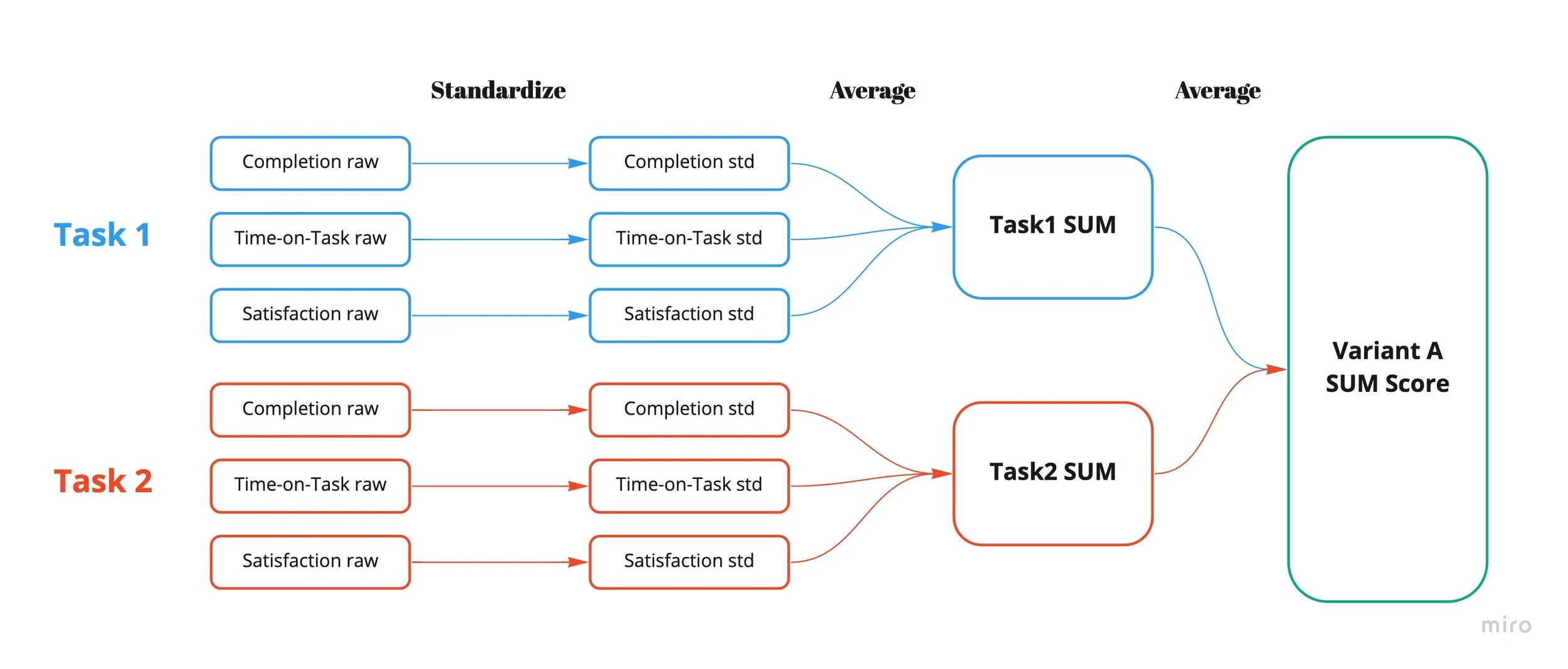
SUM (the single usability metric) is a standardised score that combines the three things you actually care about in a usability test: did people finish the task (effectiveness), how long did it take them (efficiency), and how did they feel about it (satisfaction). One number per variant. Argue about the number, not about which mockup looks more polished.
The reason I reach for this over an A/B test is independence from engineering. You don't need a build, a feature flag, or a rollout cohort. A clickable prototype, a task script, and a stopwatch are enough to start measuring.
The competing concepts
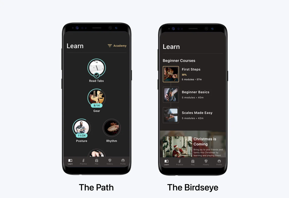
At Fretello, the Learn Path workshop (the one I describe in the Fretello case study) produced two prototypes. Both clickable in ProtoPie. Same content underneath, different mental models on top.
- Variant A — The Path. A guided ladder. Beginners pick up where they left off; the next module is always the obvious one.
- Variant B — The Birdseye. A course catalogue with progress overlaid. You see the whole landscape and decide.
Usability analysis
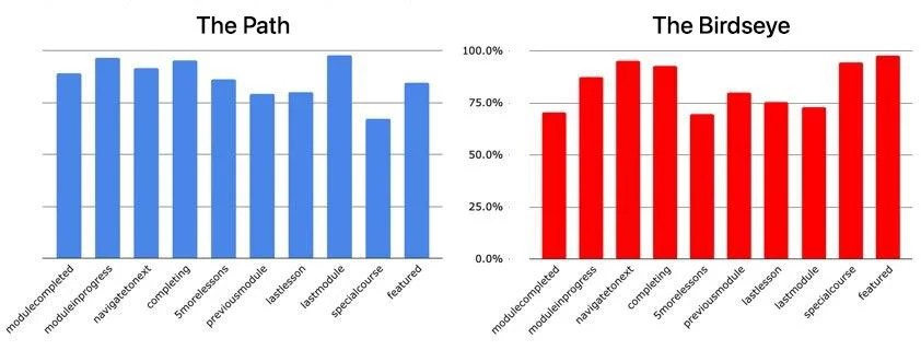
We wrote a task script that mapped to the requirements: completing a module, navigating to the next module, finding a featured course, picking up where you left off, jumping to a specific lesson. Three rounds of testing wrapped inside two sprints. Each task captured completion, time on task, and self-reported satisfaction; we standardised the raw scores and averaged them into a SUM per variant.
The Path won. Average SUM across tasks: 91.5%, margin of error 11%.But the Birdseye wasn't done. On a few specific tasks (browsing for a featured course, finding a lesson they hadn't done before) the Birdseye was actually winning.
Combining the concepts
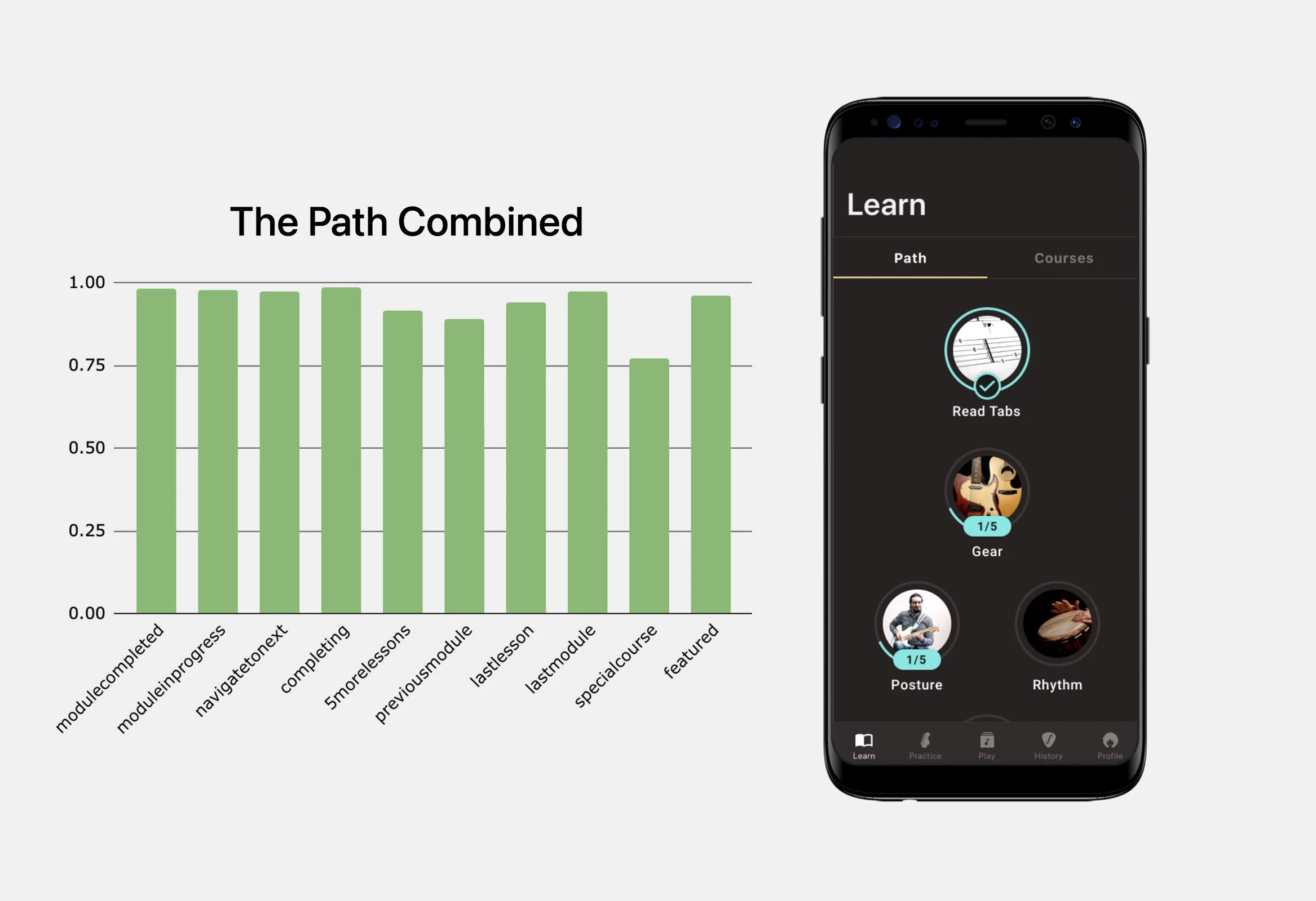
After arguing about it inside the UX team, we ran a third prototype that took the Path's spine and bolted on the Birdseye's catalogue affordance. Two ways into the same content: the guided ladder for beginners, the catalogue for explorers.
The combined prototype scored above 75% SUM on every main task. No more trough on the Birdseye-favoured tasks. We worked with engineering to spec it, shipped the MVP into production, and the numbers landed:
- Week-one retention: +35%. Beginners who installed the app stuck around long enough to hit course three.
- Trial-to-paid conversion: +20%. People who stayed engaged were more likely to convert.
The lesson, obvious in hindsight: when two prototypes both score well, the right answer often isn't to pick one. It's to ask what each one is doing well and whether you can have both without confusing the user.
Why I keep coming back to this
Two reasons.
SUM is the cheapest objective evidence you can get.If your team is split between two designs, put the prototypes in front of users and let them break the tie. The conversation after the test is fundamentally different from the one before it: not “I think A is better,” but “users finished task 3 a fifth faster on B.”
It pairs cleanly with hypothesis-driven design.Your hypothesis names what you expect to be true; SUM tells you whether it was. The metrics you measure (completion, time, satisfaction) are the same shape as the “We'll know this is true when…” line.
Stuck between two designs, or watching retention leak with no obvious cause?
Albot, my clone bot, is one click away. He can talk through how I run benchmarks like this, when SUM is the right tool, and whether I'm a fit for what you're after. Or just say hi.
Other case studies
- The SellerCrowd contribution engine3x MRR, 65x monthly contributions, zero new headcount.
- Bringing Fretello to WWDC19On Apple's keynote stage as a Sign in with Apple launch partner.
- The GVC cashier redesign4x average deposit value, second-deposit rate from 2% to 8%, time-to-success cut from 20s to under 6s.
- Building in 2026The chatbot, scorer, and digest that run this portfolio.
- Hypothesis-driven designAligning a team around tested beliefs instead of stacks of documentation.