Case study
The GVC cashier redesign
Setting a new design standard across 15 regulated-gaming brands.

Owned: Cashier redesign, +/- amount field, multi-brand button system, design language across 15 brands
Influenced: Conversion strategy, deposit-value optimisation, multi-brand design rollout
Where we started
Beginning of 2017. Material Design was already an established player in the consumer space, Bootstrap UIs were on the way out. But large regulated-gaming corporations were still figuring it out. Forms looked like Windows 98. Inputs were tedious. Transactional screens had no design taste at all.
I was the lead designer for the portal and casino sides of the GVC product, and frankly I was sick of dullness. Every day we'd open Sketch, hit a flat input designed by someone in 2008, and try to push something modern around it. We had to do something about it.
One page was the obvious target. The cashier was the single most heavily used page on the website. Same fields every time: card number, CVV, amount, currency. Same friction every time. And it was running across roughly fifteen brands inside the GVC estate. If we changed it, we'd be changing the experience for millions of people.
What the metrics were telling us
We pulled the analytics and watched. The vast majority of users were failing at least once when making a deposit. Wrong field, mistyped CVV, currency picker tripping them up, confusion at the amount step. A page used millions of times a week, full of friction, working against the business at every turn.
We took the team to Tarifa for the first workshop. The brief was simple: cut the friction. Find the simplest way for a returning user to put money in.
Storing the card was the easy win
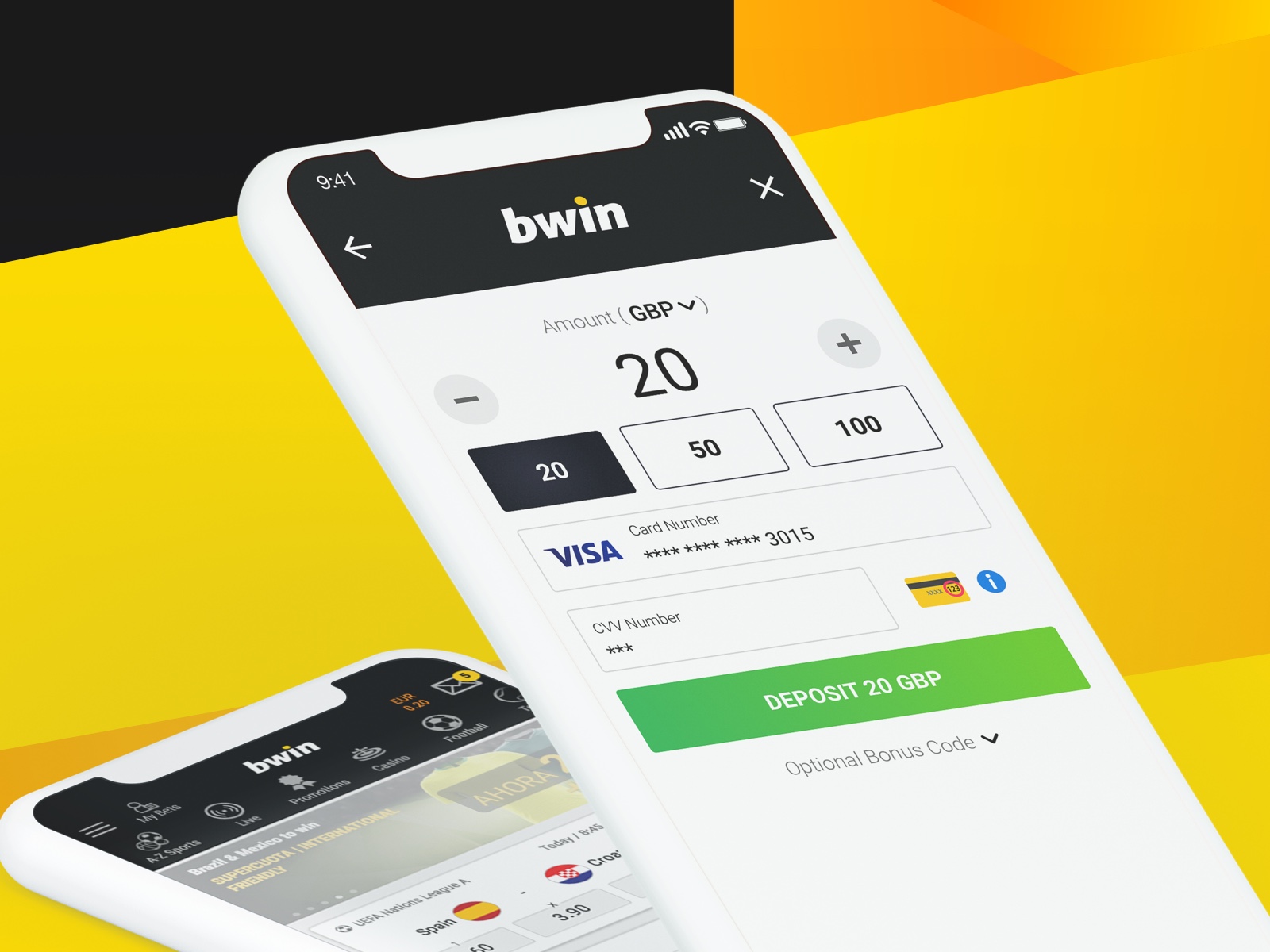
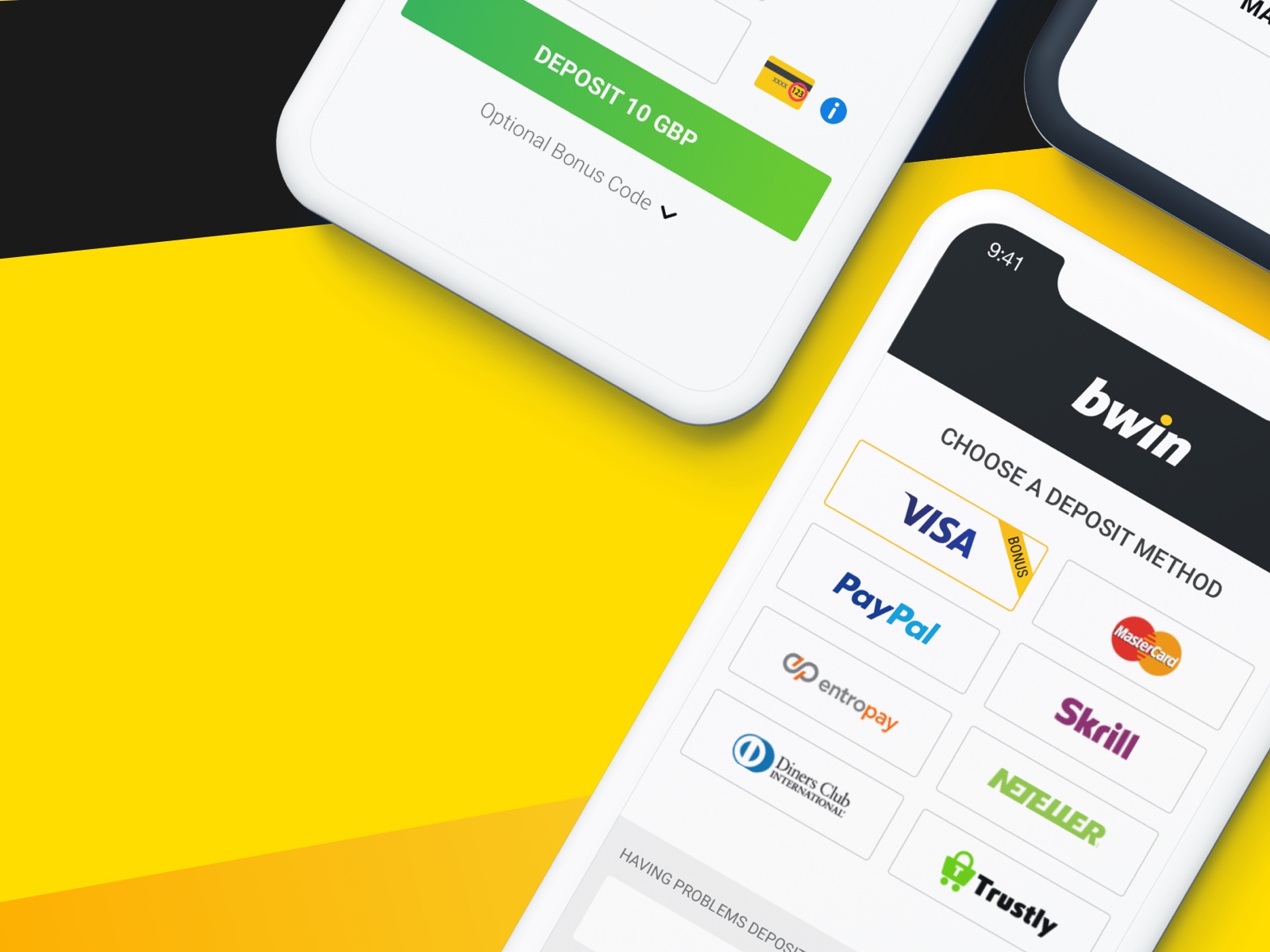
The first low-hanging fruit came out of the Tarifa workshop in about an hour: store the card details. A returning user shouldn't have to retype sixteen digits every time. Show the saved card, ask only for the amount and CVV. Done.
Easy on its own. We wanted to push further. So we wrote down the smaller-but-prove-able questions:
How often did our users actually change their deposit currency? We asked the analytics team. Answer: almost never. So the currency picker, which had been chewing screen real estate for years, became a passive label.
What if the amount field were more playful? We mocked up pre-defined amount chips next to the input — 10, 20, 50, 100 — and ran a quick test in our Brazilian market on Sportingbet, where the experimentation cost was lower. The total value of deposits over the week of the test increased significantly. The feature paid for itself before we shipped it anywhere else.
Keeping users in context
One of the bigger UX bets we made was that depositing shouldn't feel like a separate trip. Mid-slot, mid-bet, mid-flow, the cashier should appear in context, remember the user, and let them get back to the thing they were doing before they thought about money.
We rebuilt the cashier as a contextual overlay rather than a page. Saved card on file. CVV pre-focused. Amount pre-set to a value the user was likely to pick. Tap, confirm, back to the slot. The friction wasn't in any single field; it was in the trip itself.
In the tested markets, total deposits went up 15% once the in-context overlay shipped. Same product, same users, same balances. The page stopped pulling them out of their experience and the deposits followed.
The second workshop, and the +/- field
We went back to Tarifa for a second workshop. The win on pre-defined amounts was real, but the page still looked like a form. We wanted something fresh. Something that signalled this wasn't the cashier you remembered.
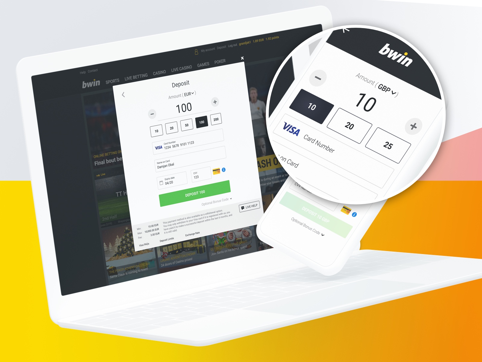
What if the amount field stopped being a form input and started being the centre of the page? A big number. Two circular buttons either side, plus and minus, that step the amount up and down without anyone reaching for the keyboard. Users could still type a specific value when they wanted, but the default behaviour was tap.
And one step further: personalise the steps. A user who deposits ten pounds for a flutter is not the same user as a VIP who deposits four figures. The +/- button could move the amount by amounts that matched the user, not a global step.
The numbers from the test were striking. For low-value customers, average deposit jumped from €10 to €40. For VIPs, average deposit went from €500 to €2,000. Same 4x lift across the spectrum. People hit the plus and minus buttons like there was no tomorrow.
The result
Crucially, total deposits did not drop.A redesign of a checkout page that lifts the value per checkout without losing volume is rare. Three numbers caught leadership's attention immediately.
Time-to-success dropped from 20 seconds to under 6. The fastest path from “I want to deposit” to “deposit succeeded” was now three taps. Saved card, +/- to the right amount, CVV, done.
Second-deposit rate quadrupled from 2% to 8%. Before the redesign, only one in fifty new customers came back for a second deposit. After, it was one in twelve. The single biggest indicator that the experience now felt worth repeating.
Consistency made the experience feel more valuable. Users on bwin and users on PartyCasino were now using the same underlying interaction model, themed to their brand. Customer-research interviews reported the cashier feeling “more trustworthy” and “cleaner” on every brand we tested. Different words for the same thing: design discipline reads as quality even when users can't name what changed.
The leadership team picked the redesign up the following sprint and put the rollout on the global roadmap. It shipped across the GVC estate in waves through 2018.
The team
None of this happens with one person. The cashier work was shipped by a tight group:
- Álvaro Velasco — Lead UX Designer (this case study's author)
- Fernando García Jiménez — Senior UX Designer
- Rajesh Venkatamaran — Product Manager
- Irene Piqueras — UX Designer
- Jay Herbert — UX Designer
- Goran Ramljak — UX Designer
Two workshops in Tarifa, several months of analytics archaeology, dozens of prototypes, and a multi-brand rollout that none of us could have run alone. Credit where it's due.
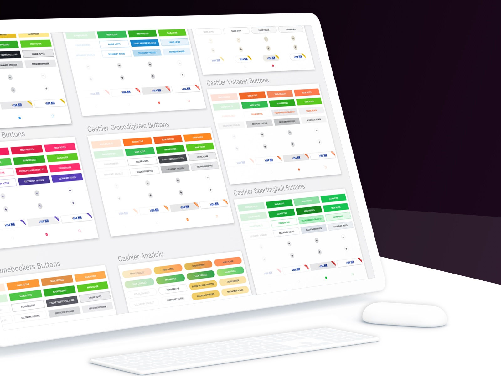
The design system that fell out of it
Shipping one cashier across fifteen brands forces a conversation about systems. PartyCasino is pink and purple. Vistabet is orange. Sportingbull and Sportingbet are different greens. Anadolu, Giocodigitale, Gamebookers, bwin — each had its own palette, voice, regulatory context, and audience.
We could either rebuild the cashier fifteen times or define a shared component model that absorbed brand variance as theme. We did the second one. Buttons, +/- controls, card chips, checkboxes, every state covered: disabled, active, pressed, hover. The same component, themed. The same interaction, branded.
What I'd do differently
Two things I'd push harder on if I had this brief again.
Run the experiment per brand, not just on Sportingbet. Sportingbet was a good testing ground because the volume was lower, but Brazilian behaviour is not bwin behaviour and not PartyCasino behaviour. The pattern transferred globally, but the per-brand magnitude almost certainly varied. We should have measured that on purpose.
Document the system from day one. We built the multi-brand component model in motion, which shipped fast but left documentation as an afterthought. Doing it as a parallel track from week one would have made the rollout to the rest of the brands take half the time.
Want the version tailored to your context?
Albot, my clone bot, is one click away. He can talk through the work, the decisions, and whether I'm a fit for what you're after. Or write to alvaro@albruv.com.
Other case studies
- The SellerCrowd contribution engine3x MRR, 65x monthly contributions, zero new headcount.
- Bringing Fretello to WWDC19On Apple's keynote stage as a Sign in with Apple launch partner.
- Building in 2026The chatbot, scorer, and digest that run this portfolio.
- Hypothesis-driven designAligning a team around tested beliefs instead of stacks of documentation.
- Benchmarking the user experienceComparing two Learn Path concepts at Fretello with SUM. +35% week-one retention.