Case study
Bringing Fretello to WWDC19
How a guitar-learning app landed on Apple's keynote stage.

Owned: Sign-up and onboarding redesign, Sign in with Apple integration, visual direction, motion
The learning problem
In April 2019 we shipped the Learn tab inside Fretello. Daily active users found their way in, started a course, and most of them quietly left. Week-one retention was below 20%. Eighty percent of the activity happened in the very first courses above the fold, the ones for absolute beginners. The rest of our content might as well not have existed.
We sent a survey to sixty percent of our learners. Sixty-eight percent told us they had almost no experience playing guitar. Eighty-four percent told us they needed someone to point them at what to do next.
I took those answers to the team in a design-thinking workshop. Everyone in one room, looking at the same evidence, framing the problem the same way. Most workshops produce a deck. This one produced a roadmap.
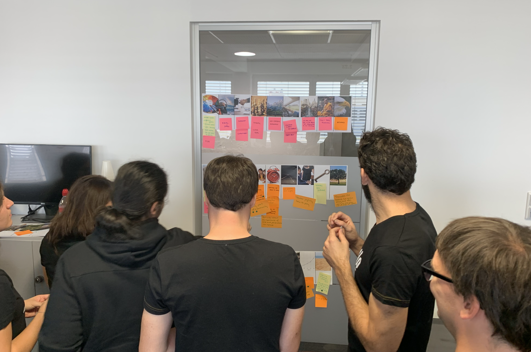
We sketched the strongest ideas. We defined the test goals, the heuristics, the hypotheses. We built two prototypes and ran them through usability rounds, benchmarking the variants with SUM against the existing tab. (The methodology piece on that test, with both prototypes and the combined design that shipped, is its own case study.)
What came out of all that was the Learn Path: a single guided route through Fretello's content for someone with a guitar in hand and no idea where to start. Pick up where you left off. Always know what's next. Skip the cognitive load of choosing.
After the Learn Path shipped, retention started behaving. Beginners stayed long enough to hit the second course, the third, the fourth.
What we learned
Two things from this build carried into everything that came next.
The workshop format only worked because we walked in with evidence. Surveys, retention curves, the empty parts of the heatmap. With evidence on the wall, the team moves from “what do you think we should do” to “what do these numbers tell us we should do.” Different conversation. Different output.
The Learn Path principle: when a user doesn't know what's next, the product should know for them. We applied that to the sign-up flow next, where Apple was about to hand us the right tool.
The invitation
The Learn Path had just landed. We were thinking about what to do next. Listening feedback was already in a good place. Fretello could hear you play and react in real time.
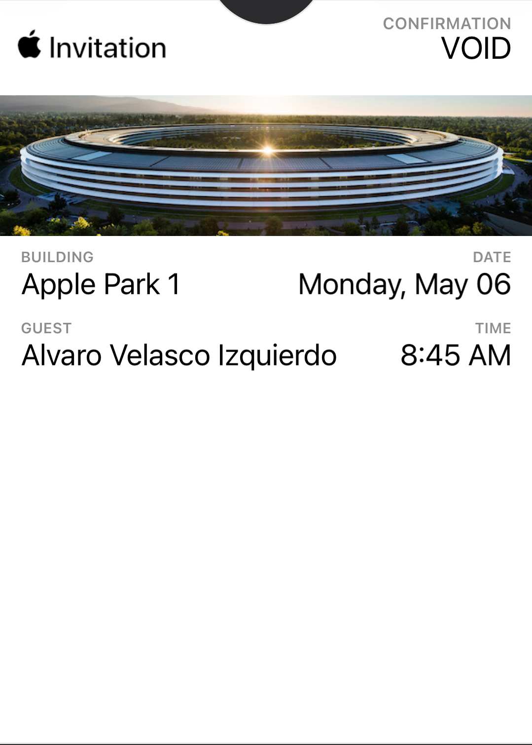
The Apple team had a strong relationship with Fretello, particularly with our CTO, Wolfgang Damm. We were always shipping the latest of whatever Apple put out. So when an email arrived inviting us to come prepare for WWDC, it wasn't entirely a surprise. They wanted to see the best of us.
This was 2019. GPT wasn't a thing back then. Small AI-focused teams like ours were figuring the space out the hard way, with whatever the era's models and our data could realistically support. Apple was about to announce Core ML 3, their on-device machine learning framework, and the goal of partner apps brought to campus was to be one of the AI showcases on stage with the new framework.
Florian Lettner, our CEO, Wolfgang, and I sat down. What do we bring?
We landed on something we called Mirror UI. A way for users to point their iPad or iPhone at their fretboard and see in real time where their fingers should go. Visual feedback to match the audio feedback we already had.
Inside the mothership
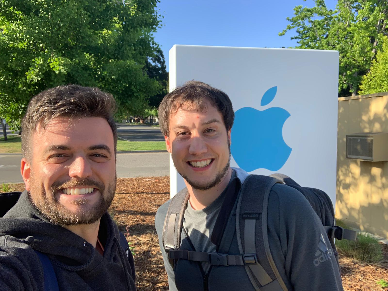
The way it works when Apple invites you: you get access to the campus, you sign an NDA that keeps you quiet for a few years, and they show you the latest tech they're working on. Your job is to make a case for your app, fitting that tech into your product, hoping you make it onto the WWDC stage.
The rules at the campus are simple. You don't talk to anyone outside your team. You don't reveal who you are or what you're working on. You sit in an assigned cabin with your colleagues, work on your idea, and ask the Apple team for help when you need it.
That took some adjusting for me, honestly. I like good morning greetings, casual coffee chats, the human texture of a workplace. The corporate quietness wasn't my natural habitat.
But I ended up loving every minute. We had check-in calls with the Apple team every other day. We watched other teams come and go, some leaving after a week, some lasting longer. I was there from May 6th to May 21st. Wolfgang stayed a little longer. Twenty-odd days, all the way through.
We did have one rough moment. One night we went out for burgers in San Jose and left our laptops in the trunk of our rental car. Someone broke in and took everything. Sunglasses, headsets, laptops, bags. Terrible.
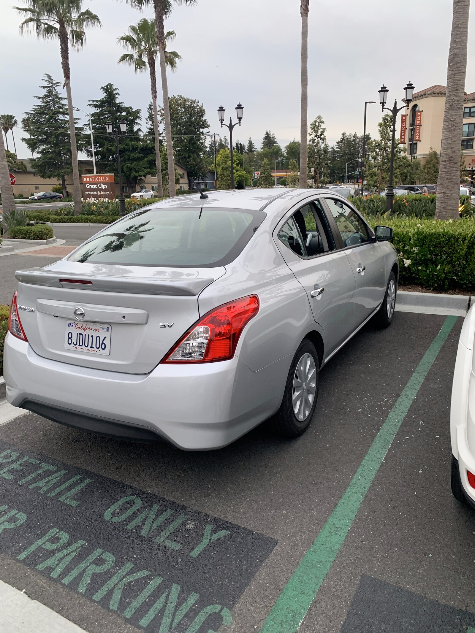
When we told Apple the next morning, they replaced everything. New laptops, new gear, no fuss. That gesture stuck with me. I still remember it. Thank you, Apple.
The pivot
What we built with Mirror UI was cool. It wasn't fully baked. We needed a lot more data to make it stable enough for a keynote demo, and we didn't have time to get it.
Apple was gentle about it. They had another project they could show us, internally codenamed Belvedere or White Horse, I can't remember exactly which after all these years and the NDA quiet around it. That was the name Sign in with Apple was carrying before the public launch.
Most online businesses lose people on the registration screen. Tedious forms. Email verification. Picking yet another password. Every dropoff is a higher cost to acquire the next user. Belvedere fixed all of that with a single tap.
I sat down with the Sign in with Apple page. The team had been cutting a few short videos for the Learn Path that I could lean on. I drafted a sign-up flow that put Sign in with Apple at the centre, with the Learn Path videos breathing through the surrounding empty space.
Apple saw it the next day. They loved it. People came around to the cabin to say so, which doesn't happen often inside the campus quiet. The design went on the keynote stage a few weeks later. I didn't know that yet.
The redesign
With the Sign in with Apple flow as the centerpiece, I crafted a sign-up experience that conveyed the emotion of picking up a guitar and learning to play. Bold visual direction. The new Apple feature at the forefront, not buried as a secondary option.
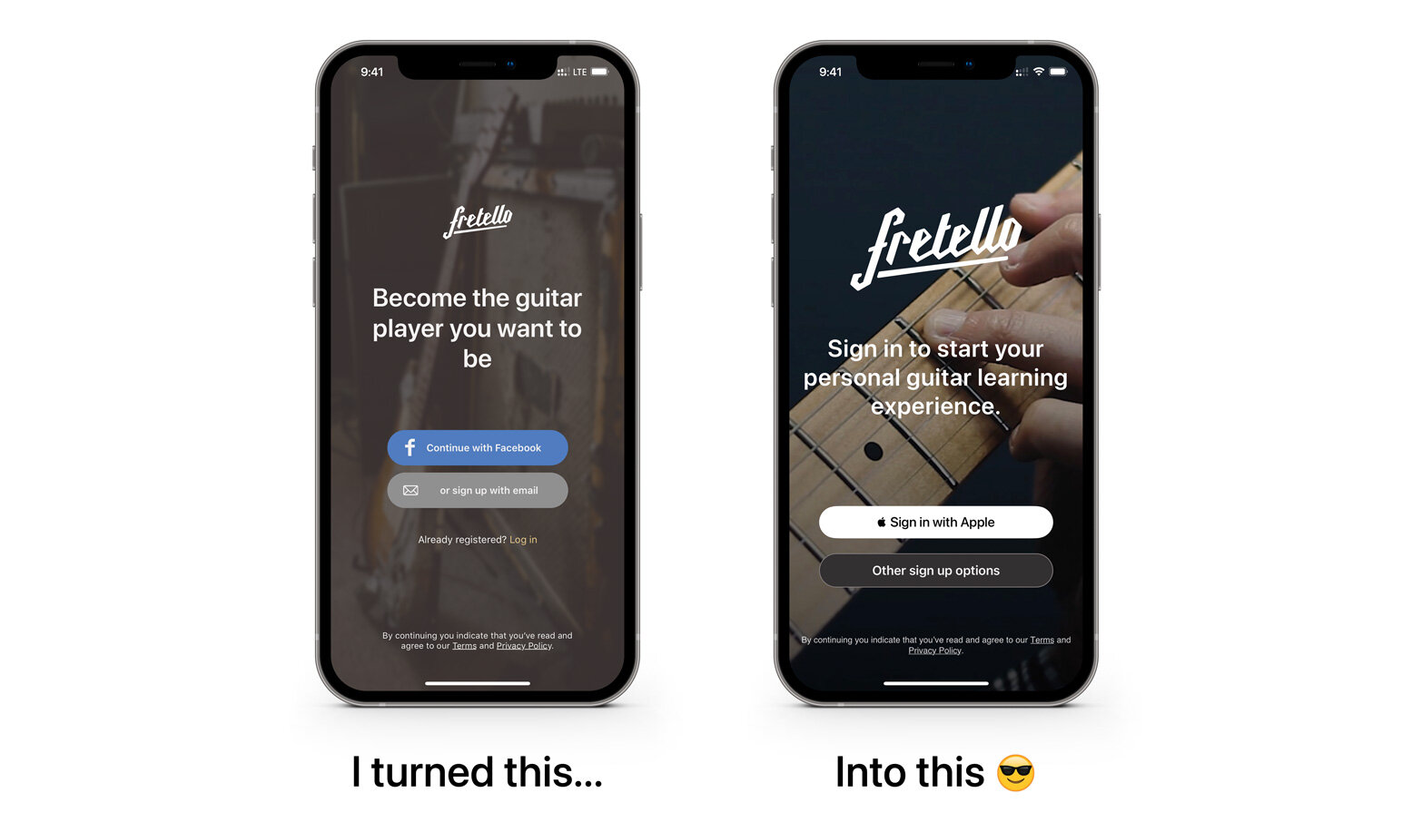
Apple loved it.
WWDC19
A few days later we landed on stage at Apple's Worldwide Developers Conference, San Jose McEnery Convention Center, June 3rd 2019. Fretello was presented by Craig Federighi during the keynote.
What changed after
Sign-ups went from around 80 a week to 1,200 in the week of the WWDC release. Roughly a 15x lift. Sign in with Apple became the most popular sign-in method for Fretello on iOS and macOS, and stayed that way.
The keynote moment was the spike. The redesign was what kept the new users once they arrived: fewer dropouts at sign-up, more learners actually starting their first course.
Looking back, seven years on
A lot has changed since 2019. The AI that Mirror UI was reaching for is the kind of feature a small team prototypes in a weekend now. What hasn't changed is the lesson I carried out of Apple Park: when the AI you brought isn't ready for the stage, the next-best thing you can build with what's already in the room is often what ships.
Want to chat about a similar project?
Albot, my clone bot, is one click away. He can talk through the work, the decisions, and whether I'm a fit for what you're after. Or just say hi.
Other case studies
- The SellerCrowd contribution engine3x MRR, 65x monthly contributions, zero new headcount.
- The GVC cashier redesign4x average deposit value, second-deposit rate from 2% to 8%, time-to-success cut from 20s to under 6s.
- Building in 2026The chatbot, scorer, and digest that run this portfolio.
- Hypothesis-driven designAligning a team around tested beliefs instead of stacks of documentation.
- Benchmarking the user experienceComparing two Learn Path concepts at Fretello with SUM. +35% week-one retention.